Name
Edge Group
Year
2024
Client
Edge Group
Category
Art Direction, Identity, Web Design
Edge Group
Year
2024
Client
Edge Group
Category
Art Direction, Identity, Web Design
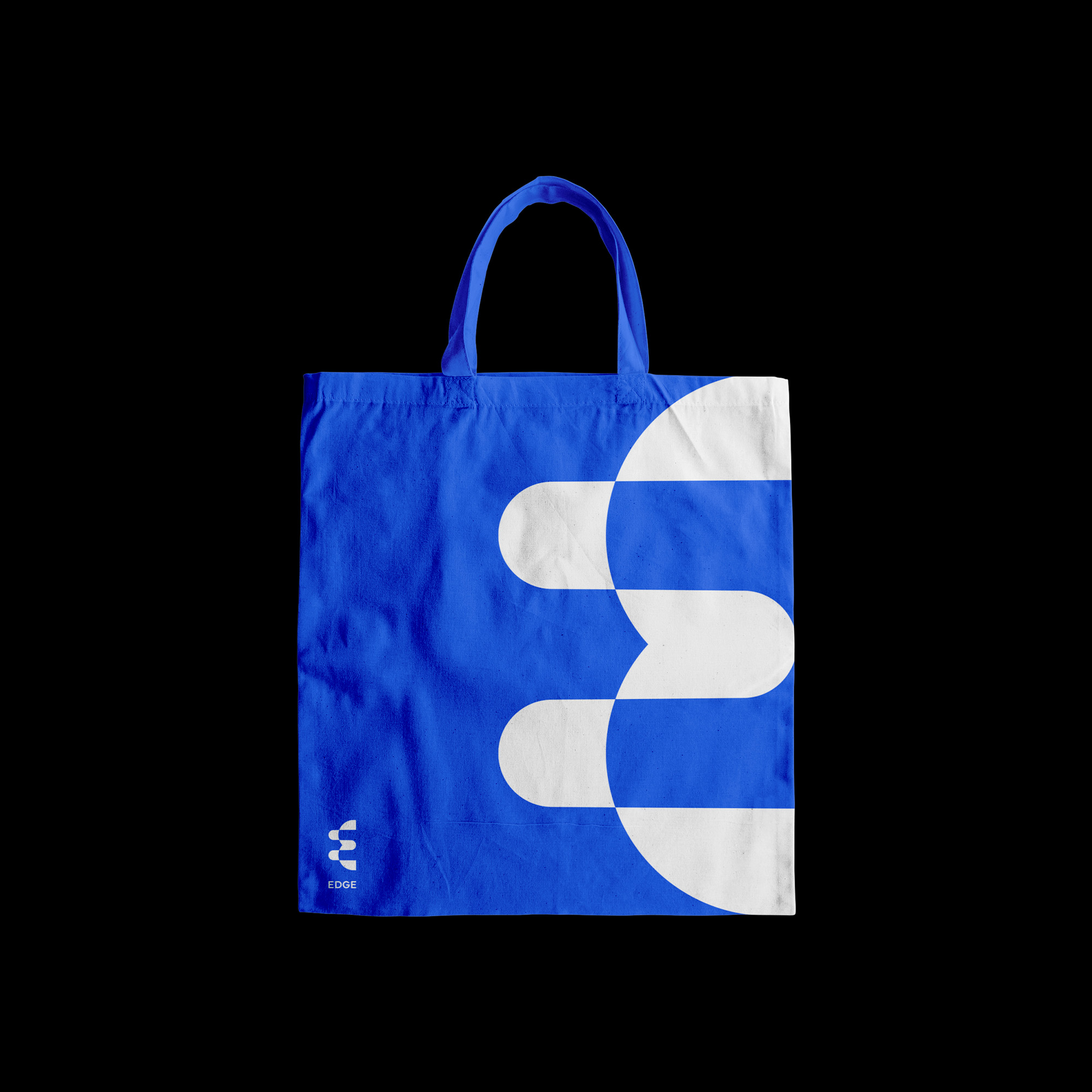
Starting with the concept of the word “Edge”, we designed a letter “E” with edges that move from the inside out, symbolising the company's core value: pushing the limits!
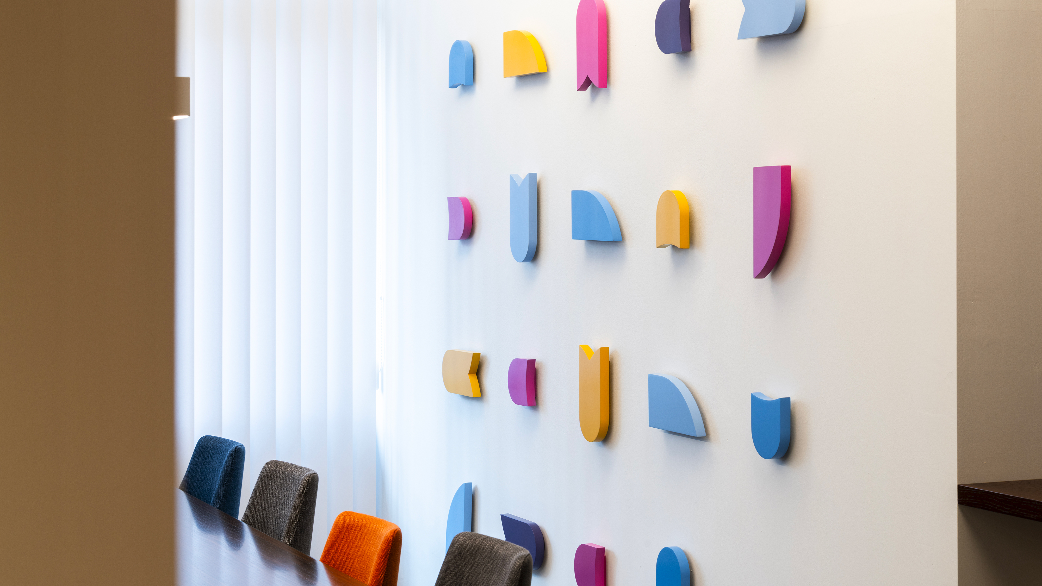
The five shapes that make up the monogram, with their soft, rounded appearance, communicate security and reliability, as well as serving as frames for photographic images and the creation of modular patterns. The saturated and contrasting colours give a dynamic and contemporary tone to the new identity.
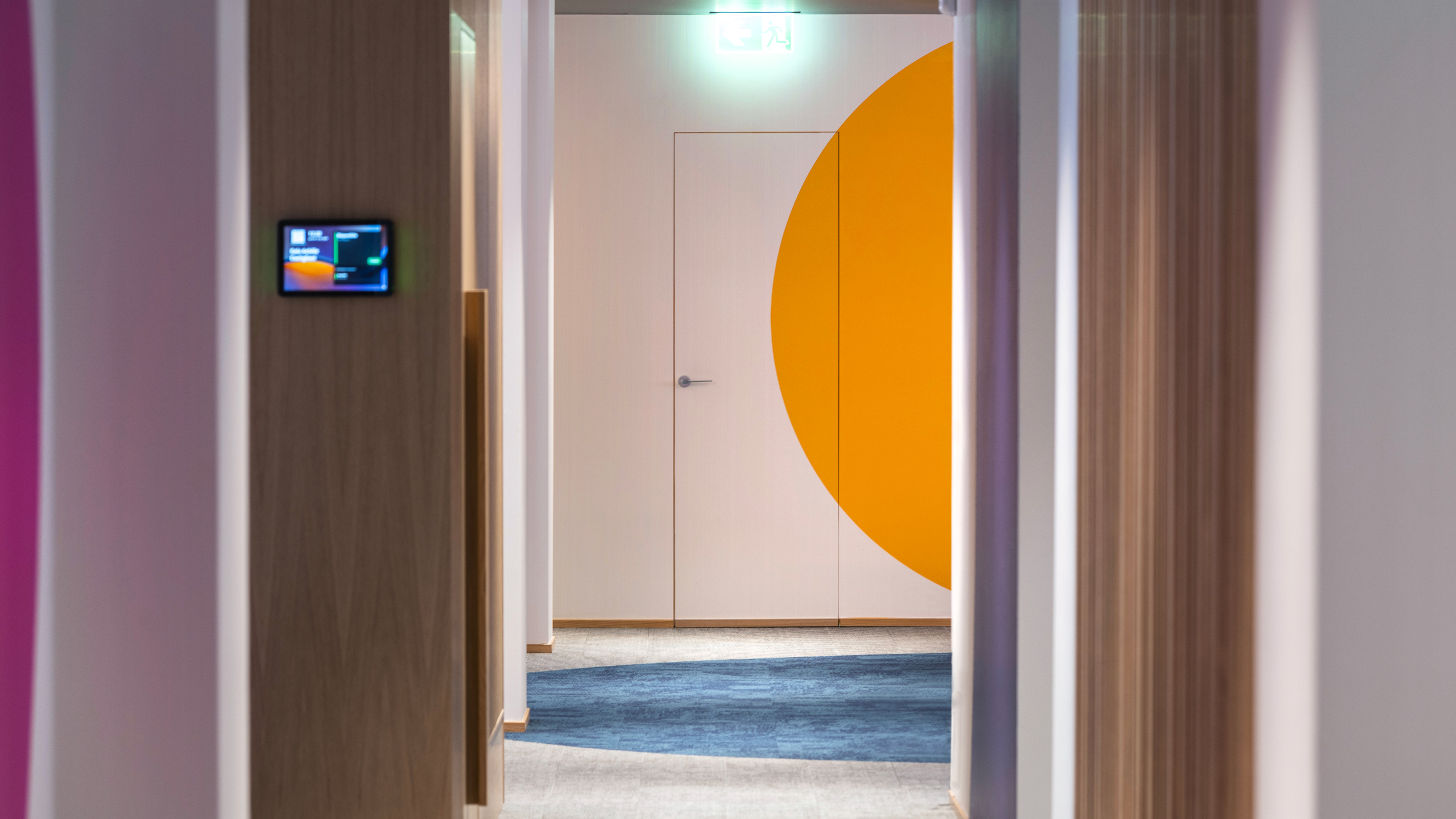
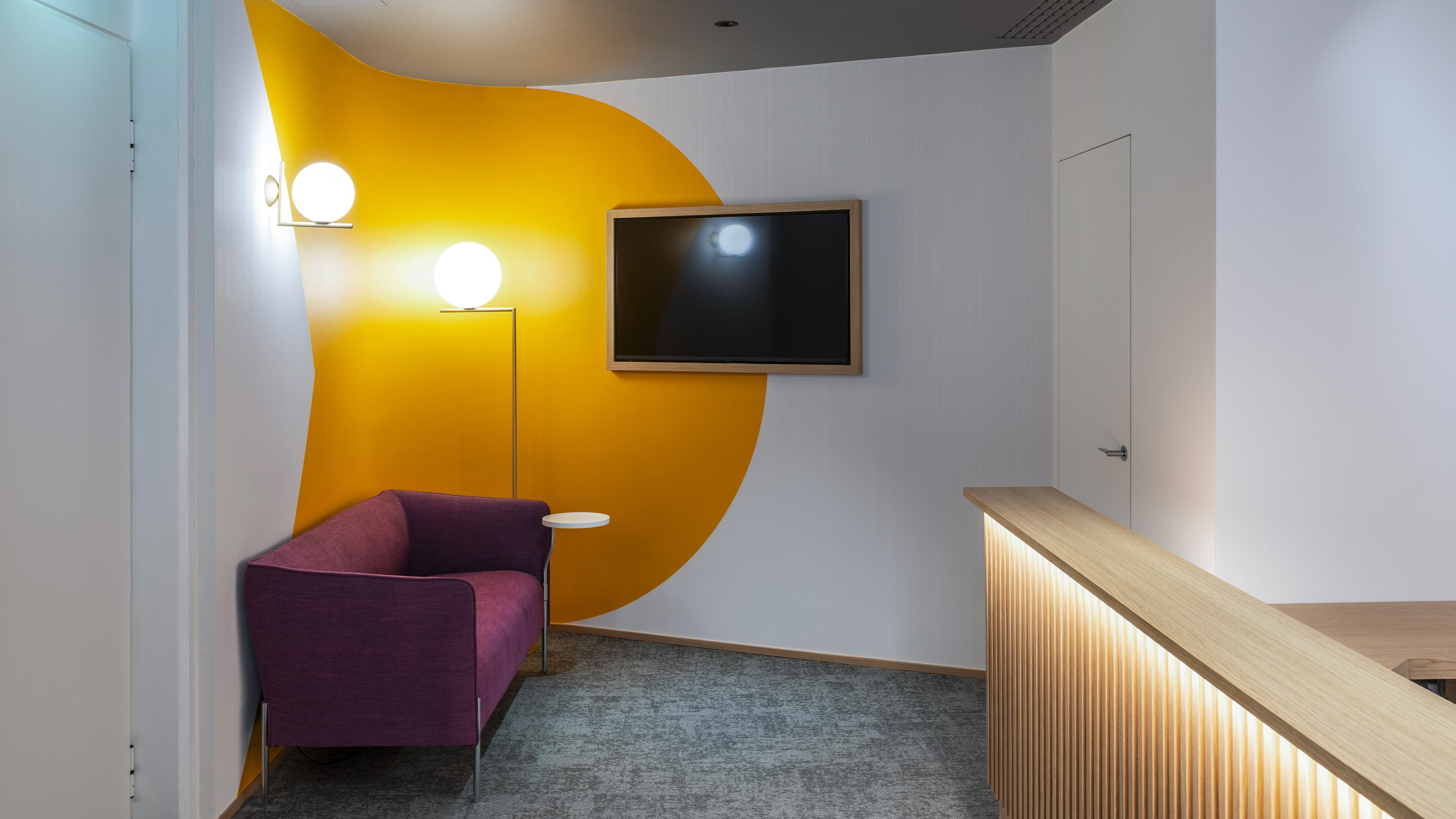
We also worked together with architect Andrea Ravogli on the interior design. Starting with the logo, colours and visual identity elements designed for the group, we went on to give recognition and personality to the company's offices.
The five shapes that make up the monogram, with their soft, rounded appearance, communicate security and reliability, as well as serving as frames for photographic images and the creation of modular patterns. The saturated and contrasting colours give a dynamic and contemporary tone to the new identity.
We also worked together with architect Andrea Ravogli on the interior design. Starting with the logo, colours and visual identity elements designed for the group, we went on to give recognition and personality to the company's offices.


Subscribe to our newsletter: